C12
Identity & Packaging Development
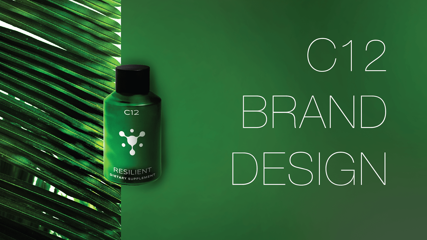
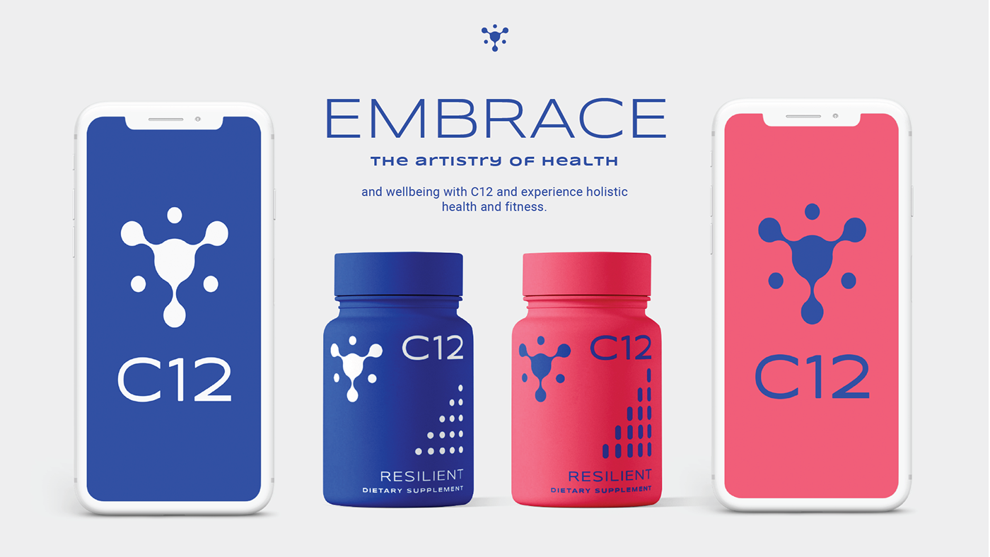
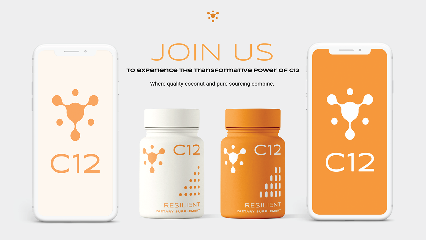
My work on the C12 centered around creating a visual language that embodies health, wellness, and resilience. I aimed to establish a clean, modern, and impactful brand presence that resonates with health-conscious individuals.
Services
Client
Duration
Challenge
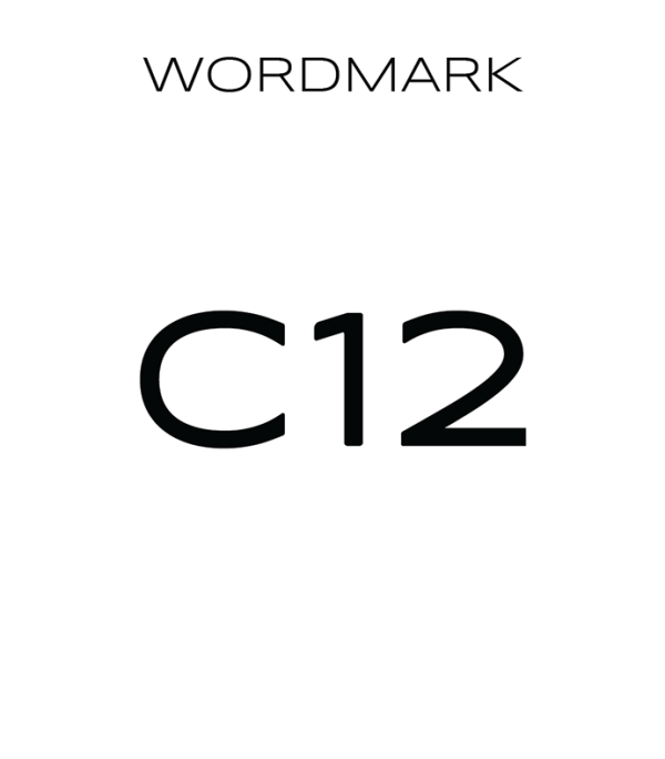
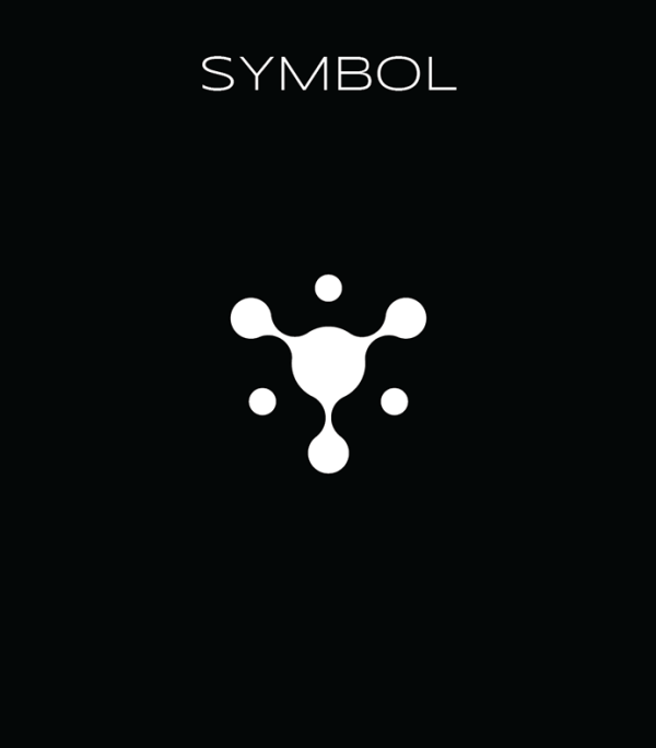
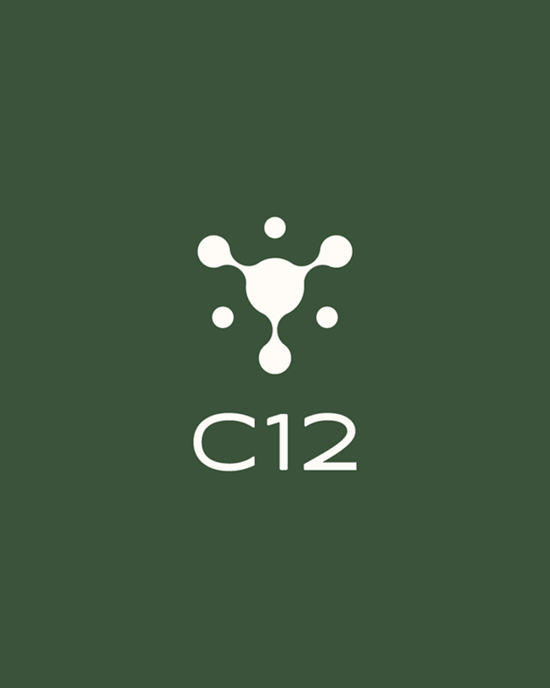
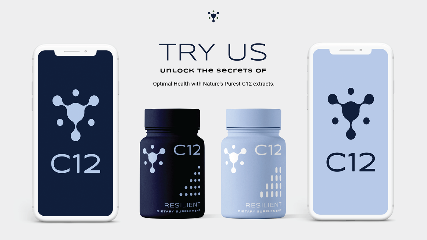
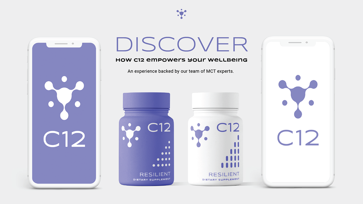
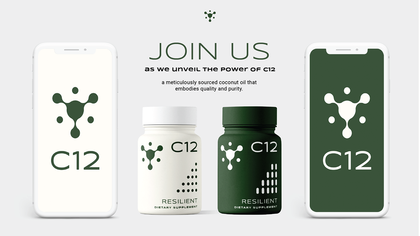
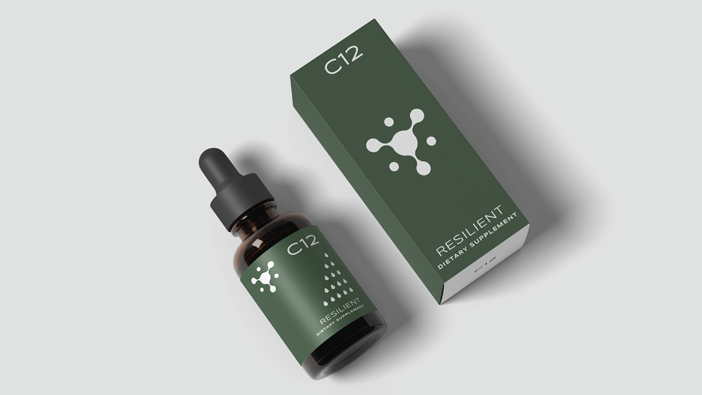
I developed a minimalist yet impactful logo featuring the "C12" lettering and an organic arrangement of shapes, symbolizing connection and well-being. The simple, sans-serif font conveys a contemporary and straightforward feel.
Key Challenges
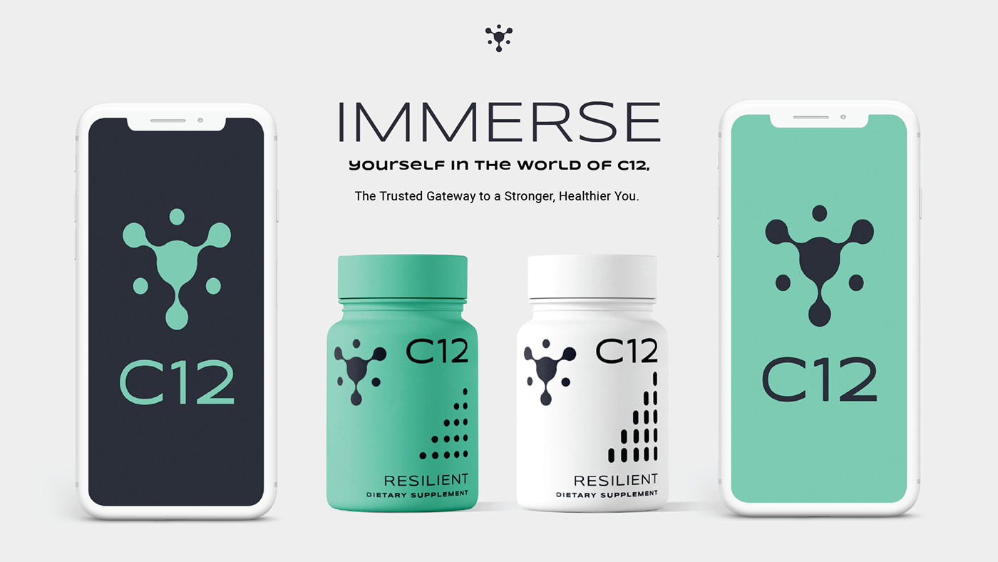
I chose a calming teal/turquoise color as the primary hue, representing health, nature, and tranquility.
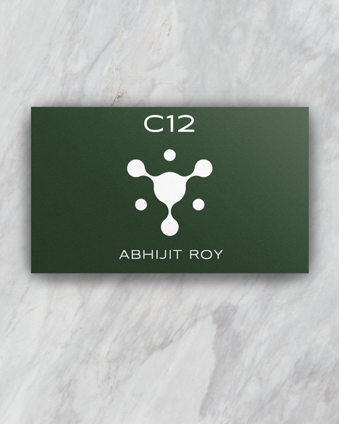
I partnered with C12 to create a visual identity that embodies their commitment to health and wellness. The minimalist design, calming color palette, and impactful visuals reflect the brand's focus on simplicity, efficacy, and a natural approach to well-being. The use of white and black creates a clean and sophisticated contrast, further emphasizing the brand's professionalism.
SMS CAMPAIGN
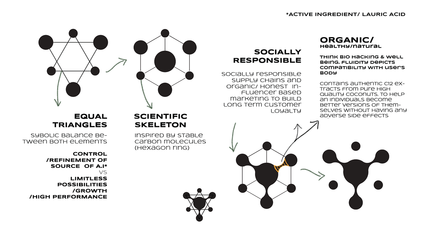
A blend of scientific and organic elements, both natural and technologically advanced. The use of triangles and hexagons, associated with stability and structure, further reinforces this idea.
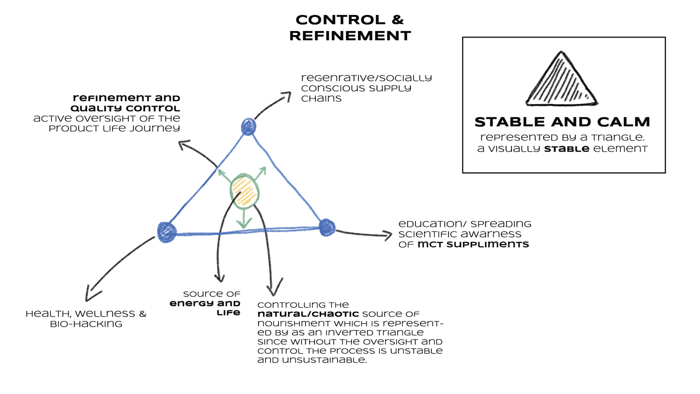
Triangles: Symbolizing balance and the interplay between different elements, perhaps representing the natural and technological aspects of the product.
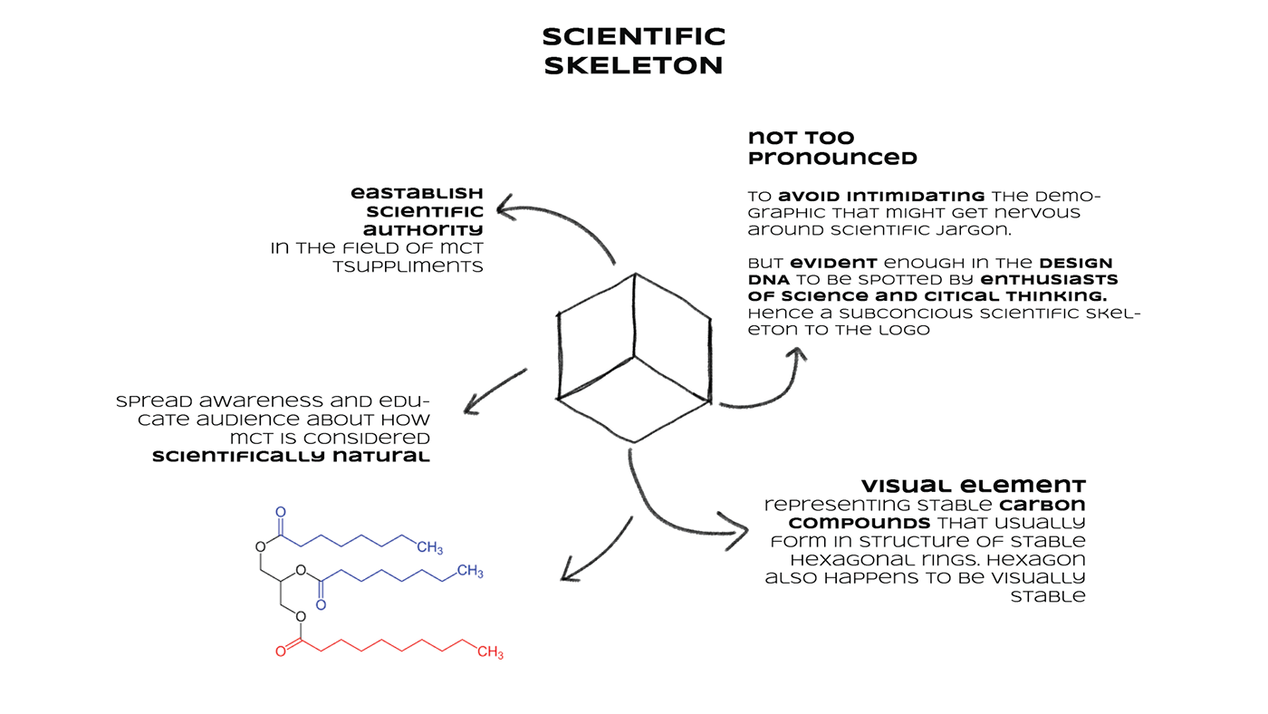
Hexagons: Often used to represent carbon molecules, suggesting a natural or organic base.
Scientific Skeleton: This element implies a structured, scientific approach to the product’s development.
Organic/Healthy/Natural: These terms emphasize the natural components of the product.
Socially Responsible: This indicates a commitment to ethical sourcing and production practices.
Performance: These phrases convey the potential benefits of the product.
Challenge
This branding project sought to capture the essence of a brand dedicated to both organic wellness and scientific rigor. The visual language reflects this balance, showcasing the interconnectedness of natural elements and evidence-based solutions.
Key Themes:
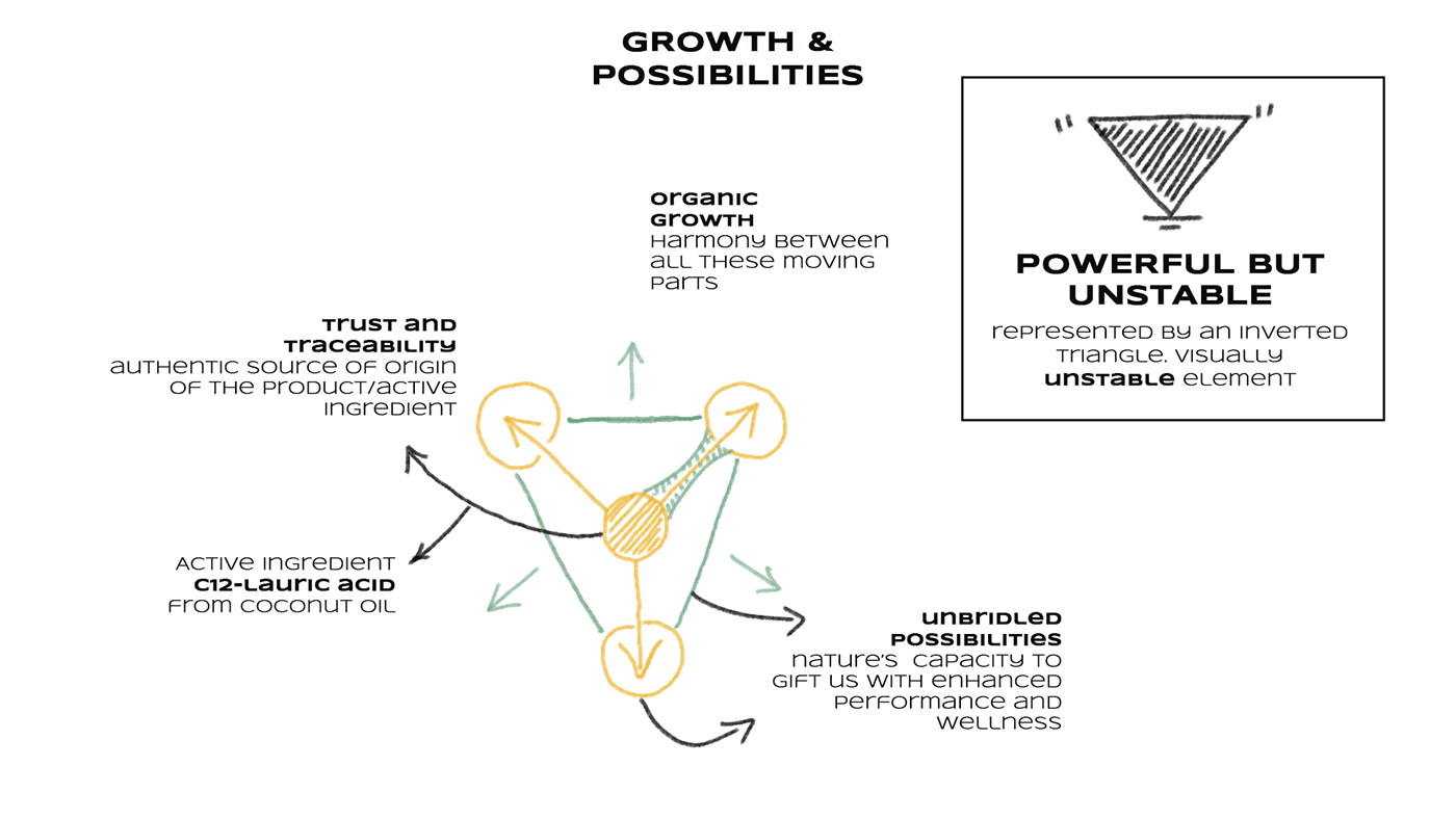
Growth and Possibilities: The central theme suggests a product that offers potential for growth and development.
Harmony: The image emphasizes the importance of balance and integration between different elements.
Organic and Natural: The use of the word “organic” and the mention of coconut oil highlight the natural aspects of the product.
Power and Instability: The inverted triangle symbolizes a powerful but unstable force, potentially representing the challenges or risks associated with growth.
Trust and Traceability: The image emphasizes the importance of transparency and authenticity in the product’s origin.
Visual Elements:
Inverted Triangle: This represents a powerful but unstable element, perhaps suggesting that growth and development can be challenging or risky.
Interconnected Lines: These lines illustrate the interconnectedness of different elements within the product.
Arrows: The arrows indicate direction and movement, potentially symbolizing growth and progress
Key Challenges
Dynamic potential for growth and transformation
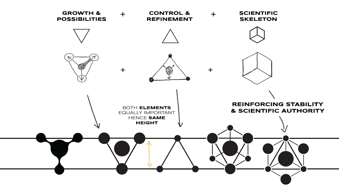
The interplay of triangles and hexagons represents the brand’s dual focus: the dynamic potential for growth and transformation alongside the stability of scientific understanding. The logo visually conveys a sense of equilibrium, mirroring the brand’s commitment to both progress and groundedness.
Symbolizing dedication to sourcing and social responsibility.
The design elements hint at fluidity and interconnectedness, symbolizing the brand’s dedication to ethical sourcing and social responsibility. This visual identity aims to resonate with conscious consumers seeking products that align with their values.


Key Challenges
Summary of the design process
1. Core Concepts:
- Growth & Possibilities: This seems to be a foundational theme, emphasizing natural ingredients, potential for transformation, and the dynamic nature of health and wellness.
- Control & Refinement: This concept highlights the brand’s commitment to quality control, scientific understanding, and responsible sourcing.
- Scientific Skeleton: This suggests an emphasis on the scientific basis of the product, with the hexagon shape representing stable carbon structures and the importance of research.
- Visual Exploration:
- Triangles: Both upright and inverted triangles are used, possibly symbolizing balance, stability (upright), and the dynamic energy of nature (inverted).
- Hexagons: This shape seems to be a core visual element, connected to the “scientific skeleton” concept and representing stable carbon structures.
- Connecting Lines and Nodes: These might signify interconnectedness, networks, or the journey from raw materials to refined products.
- Refinement and Symbolism:
- Equal Triangles: This suggests a balance between the “growth” and “control” aspects of the brand.
- “Stable and Calm” vs “Powerful but Unstable”: These descriptions associated with the triangle shapes likely guided their visual treatment.
- “Socially Responsible” & “Organic/Healthy/Natural”: These values seem to be reflected in the fluid, interconnected nature of the visuals, and the use of natural colors and imagery.
- Emphasis on Science:
- The “Scientific Skeleton” concept is central. The hexagon shape is repeated, reinforcing the idea of stability and scientific rigor.
- The desire to avoid intimidating scientific jargon suggests the visuals aim to be accessible while still conveying a sense of authority.
- Overall Brand Identity:
- The combination of geometric shapes and organic lines creates a unique visual language that reflects the brand’s values.
- The emphasis on balance, stability,
